Wednesday, February 9, 2011
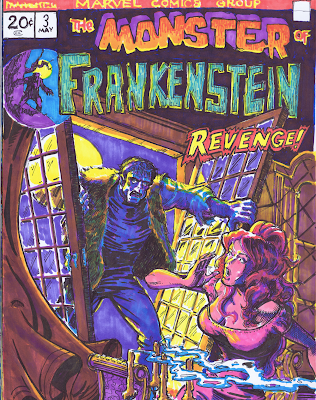
Ploog in Space: MoF no.3
More Ploog! As I mentioned in the first post, I wanted to do a number of these Ploog covers from his early run on "The Monster of Frankenstein"--before Marvel changed the logo. If I were to take a guess, I'd say this logo was an invention of Mike Ploog himself--so well attuned to his sensibility it seems to be. I loved drawing this logo, it really has that movie monster vibe.
I've talked a little about pictorial space, in Kirby and Kane. In some of these early covers, Ploog defines a space all his own-very different from either K & K -and a unique response to the division between upper and lower tiers seen in early seventies Marvel covers. In this piece and in a few others, there's an almost elliptical sense of space. His figures seem to be scooped up within a curvilinear embrace that holds them within the boundaries of the page, but allows for breathing room in and around them. Not only does Ploog subvert the editorial restriction, but he uses this innovation to expressive effect as well, the elliptical space imbuing a sense of volatility and unease appropriate to his subject.
Subscribe to:
Post Comments (Atom)


No comments:
Post a Comment