Showing posts with label Geoff Grogan. Show all posts
Wednesday, October 26, 2011
plastic babyheads in your pumpkin
NEXT TUESDAY! at lookoutmonsters.com! Aha! Yes-after much ado about great fanfare for common men everywhere-the much anticipated-Plastic Baby Heads from Outer Space will finally land upon your browser’s shores! Imagine –Thrills!Spills! Chills! EVERY Tuesday and Thursday! Well-at least for as long as I can keep up with that, with UFOOLU and all the other shit I’m putting out there.”Plastic Ono Bands from Outerspace” will begin and befoolu NEXT TUESDAY! at lookoutmonsters.com
So— be prepared!
*(having a bit of trouble with wordpress missing scheduled posts–so if it’s not up in the A.M. you know why!)
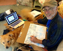
I’m pretty excited about this–and I’ll tell you why. (Hah! no one asked you why you idiot! hah-what do I care? I’m a college professor, I’m used to talking with nobody listening!) Cause it’s so much damn fun, that’s why! I know, I know–after “Monsters”and “fandancer”–what is this webcomic thing all about? Well-it sure ain’t about the money! And it sure ain’t about the fame! C’mon! It is about the work—and looking at things from my middle aged vantage point–*ahemahem*—I can say that the work will lead you places, for what reason–well, you may not know right away. But if it’s happening–just follow it, don’t hold it back. –it may be leading you somewhere that is boffo! And worthwhile stuff will happen along the way-you betcha!
And “Plastic Baby Heads from Outer Space” is a helluva lotta fun. It really is. and when you start it, you think you know where it’s going–but LEMME TELL YOU–YOU DON”T! and the only way you’re going to find out where it’s going is to follow along! Yowza!
I’m psyched–hope you’re psyched–gotta get back to coloring a page! See you at http://lookoutmonsters.com for a new“ Look Out! Monsters” page on Monday–and then, Plastic Baby Heads from Outer Space–beginning NEXT TUESDAY!
The day after Halloween! Yaay! SOOOOO---pick your head up out of that plastic pumpkin and surf on over to Lookoutmonsters.com! & if you haven't yet checked it out at lookoutmonsters.com then here's the first installment for your Halloween pleasure-already up at the pbhfos page right now! Trick or Treat!
Tuesday, March 1, 2011
28 covers, 28 days
Today-a recap! A sample of some of my favorite cover versions included in the past month's marathon. All freehand, no pencil and using prismacolor markers, both color and the premier line of black pens. ( early on I used a Uniroyal ball point--which encouraged a much looser approach---the "Kamandi" was done with that one.)
This project has been a lot of fun, a great exercise, like going back to school in a way. Originally I'd wanted to a mindless endeavor, as I was bogged down at work, but once I was into it, mindless it was not! As time went on, some of them I interpreted more freely than others, some of them I felt a need to be more faithful to. (Well--when you're putting yourself up against Neal Adams I think the challenge is just in trying to stay in the ring for the first couple of rounds!) So look 'em over---and if you're enjoying them check out the full cover versions album !
(or if you're on facebook you can check it out this album)
IF you'd like to see the entire run of 28 covers--check out the cover versions album !
(or if you're on facebook check it out this album)
Labels:
Comic book covers,
cover versions,
Geoff Grogan
Monday, January 31, 2011
Copying from the Masters
Hey Hey Hey! I know, I know! I don't write, I never call! Sorry, Mom! I'll be better , I promise.
Well, yeh--- I've been away from "Pulp Ink" for way, way too long -(a year and a half!)-and so--- as a special event/re-introduction, for the entire month of February I'll be making this space my own personal "covered" blog! My first example is to the right-- "the Monster of Frankenstein no. 2" drawn by the great Mike Ploog, and covered by Grogan. The original cover by Mr. Ploog is below.
Every weekday in February, Monday through Friday, (maybe Sat & Sunday too--we'll see), I'll be posting my versions of some of my favorite comics covers by some of my favorite artists from the '60's and '70's. Almost all of the comics are from my personal collection---comics I grew up with and loved, and then which I sought out specifically as an adult to replace comics from my original collection, a collection lost to me back in the early 1980's. So these are comics and artists I revere.
Almost all of these have been done in the last month or so,
for no other reason than to have fun, to reacquaint myself with some of the impulses that engaged me as a kid, to stay artistically active in a period when other commitments have kept me from the studio. And just to draw, draw, draw!!!!!
Initially I was using a Uniroyal bal point pen--and sketching loosely--doing a drawing in about a half hour or so. (You'll know those drawings when you see 'em!) The pen ran out-- and then I started in with Prismacolor "Premier" pens for the line work and and Prismacolor color markers for painting. My one restriction was to work freehand--without any preliminary sketching, no pencil work, no tracing or gridding for transfer. I tried to stay true to the originals as much as I could, but I tended to play around with color. So--the best ones are the most recent, and the time I spend on them is anywhere from a couple of hours up to 4-6 hours when I include the color.
These sketches are meant as sincere tributes to artists who had a formative influence on me, artists whom I repsect, admire and yeh, love. My childhood would have been sorely lacking without their presence.
I'm starting with "Frankenstein" and Mike Ploog because Old Frankie and I go way back, and because I love Mike Ploog's stuff from this period. I've done four Ploogs from his run on "Frankenstein" so far. This particular cover is notable for a couple reasons. I'm struck at how different the original's color is from the feeling of Mike Ploog's drawing. I'm guessing someone in editorial felt Ploog's image was too static to jump off the comics racks, and so they went with the most acidic, garish colors they could find to in order to animate it. Ploog's wonderful drawing is filled with pathos and loss-- not Marvel's stock in trade in those days. There's none of the Marvel "action" prevalent on almost every cover of the period (remember this?--"This is IT! The greatest Action Ish of All", etc. , etc.)
Nor does the image exactly live up to the promise of the bubble: "the most soul-shearing shocker of all!"(stuck on the cover well after the fact, I'm sure) But Ploog does bring a subtle sense of life to his figure grouping through the movement in the Bride's bandages, and the forlorn gaze of the creature. Guess that wasn't enough for whomever was looking over the covers in those days.
Mike Ploog did a lot of terrific work for Marvel in the early seventies, on Frankie and his buddy in horror, "Werewolf of the Night", following up John Severin on "Kull the Conqueror" and last but not least, "Planet of the Apes". A cartoonist's cartoonist, Ploog brought a terrific sense of brooding, Eisner-esque atmosphere to all of those projects. No wonder he was the illustrator credited on the Spielberg production of "Young Sherlock Holmes". (coincidence? just days after I began these homages to Ploog, my wife and I were watching "YSH" on Netflix --and there--at the end-- was "Mike Ploog" in the credits!)
I'll be bringing more of Mike Ploog's "Frankenstein" your way in the next couple of weeks!
Tomorrow(Wed.Feb.2): Curt Swan!
Labels:
covered,
Geoff Grogan,
Mike Ploog,
The Monster of Frankenstein
Saturday, September 19, 2009
SPX , LoM news and simply shameless self-promotion!
Hey Monster Fan! Ever since Kevin Mutch of Blurred Books and I started
pissing people off with our new blog of comics criticism , Next Issue! this past summer, I've been remiss in posting here on the personal side. My apologies! I got so caught up in Next Issue! - my own interests have sort of taken a back seat. But I'm back--with some news and updates--so without further ado:
ITEM! I will be appearing at SPX-still the original, premier small press comics convention on the East Coast-- Saturday, September 26 from 11AM to 7PM and Sunday, Sunday September 27 noon-6PM at The North Bethesda Marriott Convention Center in Bethesda, Maryland.
I'm excited because this year we've got a full table--and we'll be displaying a lot of wonderful stuff--and more importantly--we'll be running a big, big SALE on Look Out! Monsters- and all of our books! How big is big? How does this sound-"Look Out!Monsters"-$5.00! Nice Work--$5.00! Buy all four issues of Dr. Speck"-$5.00! Posters-$5.00!!!! So don't walk -- run for table-E11--It should be to the left as you walk in.
ITEM! I'm also hoping to draw some at the show-(If I've got enough maneuvering room) -and some of those drawings will feature the lead figure of my upcoming follow-up to "Look Out!Monsters" Hint: it ain't a monster book!
the drawings are likely to be in the manner of some of the material for the book--charcoal and pastel--large(18" x 24") and between $25.- $50. a pop. If you're looking for some original art-at an affordable price--look no further!
If you're looking for some originals at an unaffordable price-I should have some collages and masks with me too-if I can get together this make-shift display unit this weekend. But I make no promises!
ITEM! I have short piece in Andrei Molotiu's beautiful new book, ABSTRACT COMICS: the Anthology from Fantagraphics. This is the ground-breaking book that's creating so much buzz--and for good reason-there's a wealth of thought-provoking material between its covers.
ITEM! in addition to Abstract Comics, I also have a piece in the Silent Pictures exhibition organized around Art Spiegelman's collection of wordless comics, at the James Gallery at the CUNY Grad Center, 365 fifth avenue, NY. Curated by Andrei and Linda Norden, the show is up until October 11th.
Whew! shameless self-promotion is exhausting! How has the Man done it all these years?
Tuesday, June 16, 2009
Look Out! Monsters News
Item! 

In February of this year I received a University grant to help me publish a follow-up to Look Out! Monsters - and by this time next year that book should be in available to the public. ( And that means MoCCA -- if it remains a June show). I don't want to say too much just yet--but I can tell you this: I'm a little guy, but I like a big sandbox to play in-so LoM #2 ( and that's only the working title)will again be a large format collage-comic. It will involve newsprint and it will be tactile! It will be artsy-farty! It will be inscrutable. You will again pick it up and ask yourself-" what the f#*k?"
The other details I'll keep close to the vest for now-except to say that certain movie monsters don't seem to be lurking about it's pages.
News will be delivered as it suits me! so check back!
Friday, February 20, 2009
Nice Work updates on Fridays!
1961! Kennedy! the Mob! Castro! in The Wild, Wild West with Johnny Cat, Sinatra-stand-in supreme! Every Friday at Modern Tales and Webcomicsnation! Here's a taste:

Monday, February 16, 2009
Look Out!Monsters at Comicmonsters.com
One of the nicer moments at NYC Comic-con was being introduced to
Rob Caprilozzi and his wife and their website: http://www.comicmonsters.com/ , where you will find everything you ever wanted to know about monster comics new and old. It's a terrific site, chock-a-block full of interesting material--particularly the "Making of..." feature--which highlights the creative process of just about everyone working in the genre of "Monster Comics" today. I've been asked to contribute a piece as well-and I'll be putting that together in the next few weeks.
Meanwhile---The Big Bad Wolf asked me some questions about "Look Out!Monsters!"-
and that interview is right here:
http://www.comicmonsters.com/features-988-Geoff_Grogan_talks_LOOK_OUT___MONSTERS.html
So check it out!
Labels:
Comicmonsters.com,
Geoff Grogan,
look out Monsters
Friday, January 2, 2009
Btwn the Lns 2: questions and answers;Hopper and Rockwell


In interviews over the years Neal Adams has voiced his admiration for the work of Norman Rockwell, describing him as a consummate story-teller. On that score you get no argument from me-- or those zillions of other calendar/poster purchasing consumers. Rockwell's continued popularity resides in the clarity of his narrative, the familiarity of his characters and the innocent humor with which he presents depression-era America.
Every aspect of a Rockwell image contributes to the story he is telling--from the obvious details-- such as the facial expressions of his characters, their postures, the clothes they wear--to those that are more subtle;-- the time, the place, the details of the setting. In Rockwell's world- all of the elements are explicit--so that there is no mistaking where, when or what. This explicitness extends to the manner by which he handles his materials as well, reigning in any expressive capabilities of his brush and paint, lest they clutter the canvas and distract from the narrative.
The painter Edward Hopper also mines the terrain of that period-and while he is certainly admired, it would seem odd to say he was popular. He too tells a story, and depicts an America that is familiar --and while one could repeat many of the same words used above to describe Hopper's use of detail- the end result is something quite different. And that difference resides in Hopper's inclination to be circumspect, to imply rather than explain.
It would be a mistake to say that Hopper simply plays with ambiguity for its own sake. His images are filled with questions, questions that arise not only because of his discreetness but also because of his interest in the ineffable, his deep feeling for light--and time. He uses paint to encapsulate the mystery of light upon a door , not to paint the door.
Rockwell's narratives-as pleasing and comforting as they are--conform to well-known archetypes, to an idea of a mythic America that is well-known. Every thing he depicts is complete, defined-- according to the needs of his narrative -and his audiences'expectations. He uses paint to satisfy expectation-- to define his objects, settings and people so well that questions are resolved apriori .
It is not only this-but the character of the questions Rockwell addresses: "what does an archetypal awkward teenager(of the depression-era) wear on a prom or first date? Where would they go? Who would be there? What would they say? How would they interact? What kind of soda would they drink?" -- that are both the source of his success as an illustrator--and the limitation of his art.
With Hopper we are left to wonder. The place and time are familiar to us-we recognize the light of morning, the brownstone rooftops. But the light-- seems not to define setting so much as to penetrate the inner life of the figure, to illuminate the relationship between the figure and the ineffable; inquiry and contemplation, the known and the unknowable.
Wednesday, December 24, 2008
Btwn the Lns:Illustration, Comics and "A"rt; Part 1


In so far as comics are an imagistic art, there remains a relationship to illustration that is worth examining-not so much for the historical ties( which are well-documented) but for conceptualizations of both practice and appreciation that resonate witihin the artform and its industry yet today. Comics are not illustration, but the methods of the latter have often been used in the service of the former. Just the same, there is also an important distinction between illustration and art(with the capital "A")-having nothing whatsoever to do with commerce--that has had a tremendous impact upon the development of comics as an artform, in both perception and practice.
First -it must be granted that illustration, as a practice and artform in its own right, differs in its premise from that of "fine" art. This distinction resides not in illustration's tradition as commercial practice, nor in the disingenuous notion of art-for-art's sake that disguises the big-business that is the artworld. Rather-the distinction can be seen in the way the artist approaches their task in both conception and in the use of materials.
This was made clear to me recently during a semester -ending critique of a student's work in the Art dept. at the University where I am fortunate enough to teach. A good student, a substantial amount of good work which the faculty all enjoyed viewing. Yet the chair of our department observed that the work was least effective when bound by its illustrative qualities. The student naturally asked "what is the difference between illustration and art?"
What is self-evident visually is not always so clear verbally, but after some consideration-and not at all sure of myself I offered this: that illustration concerns itself with answering the questions raised by the narrative, art raises questions of its own.
Illustration is circumscribed by narrative, art is not. Illustration is concerned with events, art with something else.
Keep in mind-this in no way precludes a work of illustration from being art. But the nature of its discourse makes this exceedingly rare, for it requires the illustrator's knowing repudiation of his craft's very reason for being.
This is why then, one can point to a Duchamp ready-made and confidently say it is art, and view a beautifully rendered J.C. Leyendecker Arrow shirt advertisement and say it is not.
Part II: Norman Rockwell and Edward Hopper
Labels:
art,
comics,
Duchamp,
Geoff Grogan,
illustration,
Leyendecker
Subscribe to:
Posts (Atom)