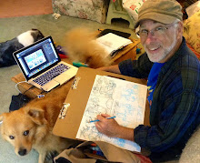
Sunday, February 6, 2011

The Generator


Dig that Gargoyle leapin' out of the page! Feel the heart pounding rush of the crowd chasing after him! That "Demon" thing is coming for you, pal-so you'd either better turn tail and run straight out of the drugstore--or --buy the sucker and take it home!
 That's why Kirby was the guy Stan Lee told John Buscema to copy-before he gave him The Avengers or Thor or the FF.
"...This is the guy...this is the look...Action--that's what we want, that's what the kids go for, that's what it's about...."
And this cover is a textbook  example of Kirby dynamism at work.  The composition alone establishes a pictorial tension that absolutely pulses with energy---The Demon, stretched taught across the two-dimensional horizontal plane, like the skin of a drum-is simultaneously pushing, pushing against the membrane of the picture plane and out into the space of the spectator! Talk about tension--talk about pent up energy---Kirby could have been his own electric company!  He was his own power supply!
Kirby's drawing never relaxes into illustrative illusionism. That kind of naturalistic, illusionistic space would loosen the hold of the forms on the surface, relax the abstract, pictorial tension he's created and  drain away the pictorial force. His goal was action, energy, to sell comics--and so he never succumbed to the temptation of creating more traditional evocations of pictorial beauty. He knew instinctively that those qualities were at odds with the kinds of abstract dynamics he was interested in. ( that's not to say Kirby didn't create beautiful images--but that's another subject!)
And it's hard to combine Kirby style with naturalism. In many of those works that make the attempt, the artist may evoke Kirby's surface qualities-the faces, the fingers, the Kirby crackle---but in bringing more traditional approaches to form into the mix(most likely because the artist's personal style is naturalistic)- the abstract power of Kirby's vision and forms is undermined. The result is-more often than not-- a kind of nostalgic evocation. *
(*there are some great ones who've aped Kirby outright in the beginning of their careers and then made the work their own.  you know who they are.)


anyway--that's the lesson I learned drawing this cover. The last one I did before the Uniroyal ball point pen ran out. That pen encouraged a swift execution--it was a thick tip and it flowed like ice skates across a pond on the page. I'm particularly happy with that blue sky. I wasn't sure I could get it with the markers I had--but a little overlapping here and there and it turned out nice. Those Prismacolors have a surprising amount of depth! 


Saturday, February 5, 2011

The Most Cosmic Cartoonist of All


 I remember--well, barely-a movie theater in Philadelphia at the end of the seventies, -watching "Altered States" and thinking I'd seen God.  Seriously.
Now, I might've had a little help with that perception---but nevertheless, I believed I'd had some kind of revelation.
Looking back, I suppose the amazing thing is that-- in the 60's and 70's-- we thought you could see a movie--like "Altered States"--or "2001"--and if one was in the proper ...frame of mind... it might--just might--- change your life.  If you were open to it.
The products of popular culture-- movies, music, comics--were more than mere commodities, more than mere entertainments. They were vehicles to an end--and the end was...? the progressive evolution of humankind...? utopia? transcendence? oneness with the cosmic mysteries? Who knew? We were certain someone did--specially endowed guides to the mysteries of existence-- shamans, musicians, artists, comic book artists.
Jim Starlin was like--one of those dudes clued in to the cosmic mysteries--like the Beatles or Dylan or Floyd--he was one of those guys with "The Answer".  By the time he was working on ""Captain Marvel", (and particularly CM #29)-Starlin was the full fledged  Cosmic Comics Guru--and I was absolutely certain that by the end of the Thanos story-arc in CM--that we'd all have achieved "cosmic awareness" along with Cap.
Did we ever get there?
Look around. What do you think?

But every time I pick up one of Jim Starlin's books from the seventies --whether it's Captain Marvel or Warlock-or even Shang-Chi---I'm willing to believe it's possible. And these days, that's no small thing, is it?


* my cover was done with the Uniroyal ball point pen, drawn quickly--30-40 minutes or so--and with no intention of adding color until much later.
there'll be plenty of Starlin to see--in various degrees of finish--
before the month is over!
Enjoy! And think Cosmic!

Friday, February 4, 2011

The Champ

It pisses me off when people diss Neal Adams.
PISSES ME OFF! Punks not worthy of sharpening the man's pencils out there bad-mouthin' the Champ. Not worthy of sharpening the man's pencils!  I'd like to see 'em go half a round with Neal Adams-I'd like to see 'em dare to step in the ring with the dude! Step in the ring! (& I'm talkin' about a ring in the same hemisphere, man!)
  For all Neal Adams has done for comics, for comics fans and comics creators, for every great cover , for Green Lantern/Green Arrow, for Batman! & Talia & Ra's al Ghul--for each and every book he ever worked on -- I'd consider it an honor to sharpen this guy's pencils! Better'n the friggin' Nobel Prize, man!

It's one thing to talk bad about the Champ, --but just imagine stepping in the ring with Muhammad Ali. Just Imagine! That's big time dude! And Neal Adams--he's the Ali of comics, "Da Heavyweight Champeen of da woild!" Or maybe he's the Jimmy Page of comics, churning out one amazing riff after another all through the sixties and seventies.
Whatever--Neal Adams is in a league by himself, without peer. It took me three tries on this sucker to get something I wasn't embarassed by. Three tries! He probably drew this while he was taking the first piss of the morning!  So--you got somethin' bad to say about the man? Keep it to yourself, bub. Or step in the ring.

Thursday, February 3, 2011

Mike Kaluta knows The Shadow!

 Was there ever a better version of the Shadow, in print or on radio, than O'Neil and Kaluta's?
When these came out I was 13, and the local radio station had just started to play recordings of old time radio shows from the 30's on Saturday nights. A perfect storm of Depression era atmosphere, I lay transfixed on the living room floor listening to Orson Welles maniacal laugh( you should hear the commercials: "You will skid out of control--without Goodyear Tires! HAHAHAHA The Shadow knows!" )  while looking at Mike Kaluta's pulp-y images of a wraithlike Shadow creeping in and out of the darkness. Ruthless, elusive, without remorse, The Shadow killed people for just thinking about bootlegging! And whenever did you ever see a superhero with a schnoz like Kaluta's Shadow?  The perfect proboscis for sniffing out rum-runners and the like.
These are still some of my favorite comics, and I'm sure I re-read them at least once every year or so.
What makes a great comic, a comic you return to year after year? In the end, I think it's kismet, magic, undefinable alchemy-the perfect meeting of subject and creator. As much as I am a teacher and a student of all that goes into "Art" and its making, I trust more in that which you can't control, can't circumscribe by definition or analysis. Analysis-no matter how insightful(& necessary)-always comes up short in the end. I'm not sure anyone knew that Mike Kaluta was born to draw the Shadow-I don't think any of the work he'd done prior gave the impression that he was the artist for it.
But boy was he! And these first few covers, apparently a combination of watercolor and
pen and ink-are still among some of the most  iconic and evocative images of the character  I know.
 So when I first started this little project, these early "Shadow" covers were the first I chose. And initially, I was just going to sketch them out in b & w. I was well into it before I found I wanted to add color. The image above was my second shot at "The Shadow no.4"
Below was my first try-took about half an hour-45 minutes at my office desk, after working hours and when I wanted to wind down some from a busy day.
And yeah--I spent the rest of that evening re-reading this wonderful, classic comic book and drinking in the wonderfully inky images of Mike Kaluta.

Wednesday, February 2, 2011

Curt Swan; ultimate Superman


 What can I say about Curt Swan that hasn't been said? For those of us of a certain age(YEEESH! I hate that phrase--but what am I gonna do? )there's only  only one Superman-- and of course-that Superman is the vision of Curt Swan. More so than anyone before him--( with all due respect to Joe Shuster and Wayne Boring) Curt Swan defined the iconic look of mid-20th century Superman. And not only did Swan embody 20th century Superman, but 30th century Superman as well -as you can see from today's cover: Superman no. 181, Nov. 1965.

 I suppose each generation has their Superman-and there's no doubt that Frank Quitely's visualization has made an indelible impression on the mythos-but for me, Swan's Superman embodies those characteristics that seem essential to the character--
not the least of which is that Swan's Superman is a man--not a boy--as contemporary versions of the character tend to be.  Today Superman looks maybe--mid-20's-- at the most--whereas the 20th century guy is definitely in his mid-30's.(the last Superman movie--what was that?--that guy was Superboy...maybe. He was no Superman. Give me George Reeves in the series first two years any day.)
The real Superman ( you know--the one "up in the sky!") is no wet-behind the ears whippersnapper, he's a man--he's got some gravitas dude! & Superman needs gravitas--I mean--if he's really gonna kick some inter-galactic butt he does.  Swan's Superman/Clark Kent is indeed an embodiment of mid-20th century masculinity; he's built, but in an era before hormone growth treatments. He's every kid's imaginary Dad, stoic, upright, moral, dependable, always there when the train is just about to run off the rails or the Sun spin out of its orbit.  Swan's Superman was an everyman-but an everyman you could count on, month in and month out.  Just like Curt Swan's pencils.

Of course, by the late 70's, DC's conception of Superman had settled into a rut of conventionalism, the "new era" Superman of '71-'72 remained only a dim memory, its promise left unfulfilled. And Curt Swan was left to illustrate one uninspired story after another--until Alan Moore came along and gave him the tale of a lifetime--to which he responded with perhaps the best work of his career.

This cover long haunted my imagination, the image of the future technopolis and the new, modern Superman (sporting his fashion-conscious forward-combed Beatle cut circa 1965, no less!) fueled my utopian dreams long after I had lost the actual book. As an adult I searched many dealer's boxes for a good long while, convinced it was some figment of my imagination. I was overjoyed when I finally found it--it was like reclaiming a dimly remembered dream. And yes-we really did imagine a future floating amidst stainless steel woks and pepper mills in the sky.
 I'm guessing the inker is George Klein. It's got those kind of spare, clean lines that suited Swan's pencils so well.


As if you needed any more proof of my love, and this image's profound influence on me: Superman no.181 has  now been the inspiration for at least two works--this cover recreation and the newspaper collage below, which is titled, appropriately enough: "Tomorrow's Kitchen's Today!"---In part because so much of this future architecture seems to have been inspired by 60's Kitchenware.


Tomorrow: The Shadow Knows!

Monday, January 31, 2011

Copying from the Masters

 Hey Hey Hey! I know, I know! I don't write, I never call! Sorry, Mom! I'll be better , I promise.
Well, yeh--- I've been away from "Pulp Ink" for way, way too long -(a year and a half!)-and so--- as a special event/re-introduction, for the entire month of February I'll be making this space my own personal "covered" blog! My first example is to the right-- "the Monster of Frankenstein no. 2"  drawn by the great Mike Ploog, and covered by Grogan. The original cover by Mr. Ploog is below.
Every weekday in February, Monday through Friday,  (maybe Sat & Sunday too--we'll see), I'll be posting my versions of some of my favorite comics covers by some of my favorite artists from the '60's and '70's.  Almost all of the comics are from my personal collection---comics I grew up with and loved, and then which I sought out specifically as an adult to replace comics from my original collection, a collection lost to me  back in the early 1980's. So these are comics and artists I revere.
Almost all of these have been done in the last month or so,
for no other reason than to have fun, to reacquaint myself with some of the impulses that engaged me as a kid, to stay artistically active in a period when other commitments have kept me from the studio. And just to draw, draw, draw!!!!!
 Initially I was using a Uniroyal bal point pen--and sketching loosely--doing a drawing in about a half hour or so. (You'll know those drawings when you see 'em!) The pen ran out-- and then I started in with Prismacolor "Premier" pens for the line work and and Prismacolor color markers for painting. My one restriction was to work freehand--without any preliminary sketching, no pencil work, no tracing or gridding for transfer. I tried to stay true to the originals as much as I could, but I tended to play around with color.  So--the best ones are the most recent, and the time I spend on them is anywhere from a couple of hours up to  4-6 hours when I include the color.

These sketches are meant as sincere tributes to artists who had a formative influence on me, artists whom I repsect, admire and yeh, love.  My childhood would have been sorely lacking without their presence.

I'm starting with "Frankenstein" and Mike Ploog because Old Frankie and I go way back, and because I love Mike Ploog's stuff from this period. I've done four Ploogs from his run on "Frankenstein" so far. This particular cover is notable for a couple reasons. I'm struck at how different the original's color is from the feeling of Mike Ploog's drawing. I'm guessing someone in editorial felt Ploog's image was too static to jump off the comics racks, and so they went with the most acidic, garish colors they could find to in order to animate it. Ploog's wonderful drawing is filled with pathos and loss-- not Marvel's stock in trade in those days. There's none of the Marvel "action" prevalent on almost every cover of the period (remember this?--"This is IT! The greatest Action Ish of All", etc. , etc.)
Nor does the image exactly live up to the promise of the bubble: "the most soul-shearing shocker of all!"(stuck on the cover well after the fact, I'm sure)  But Ploog  does bring a subtle sense of life to his figure grouping through the movement in the Bride's bandages, and the forlorn gaze of the creature.  Guess that wasn't enough for whomever was looking over the covers in those days.
Mike Ploog did a lot of terrific work for Marvel in the early seventies, on Frankie and his  buddy in horror, "Werewolf of the Night", following up John Severin on "Kull the Conqueror" and last but not least, "Planet of the Apes".  A cartoonist's cartoonist, Ploog brought a terrific sense of brooding, Eisner-esque atmosphere to all of those projects. No wonder he was the illustrator credited on the Spielberg production of "Young Sherlock Holmes". (coincidence? just days after I began these homages to Ploog, my wife and I were watching "YSH" on Netflix --and there--at the end-- was "Mike Ploog" in the credits!)

I'll be bringing more of Mike Ploog's "Frankenstein" your way in the next couple of weeks!

Tomorrow(Wed.Feb.2): Curt Swan!

Saturday, September 19, 2009

SPX , LoM news and simply shameless self-promotion!

Hey Monster Fan! Ever since Kevin Mutch of Blurred Books and I started
pissing people off with our new blog of comics criticism , Next Issue! this past summer, I've been remiss in posting here on the personal side. My apologies! I got so caught up in Next Issue! - my own interests have sort of taken a back seat. But I'm back--with some news and updates--so without further ado:

ITEM! I will be appearing at SPX-still the original, premier small press comics convention on the East Coast-- Saturday, September 26 from 11AM to 7PM and Sunday, Sunday September 27 noon-6PM at The North Bethesda Marriott Convention Center in Bethesda, Maryland.

I'm excited because this year we've got a full table--and we'll be displaying a lot of wonderful stuff--and more importantly--we'll be running a big, big SALE on Look Out! Monsters- and all of our books! How big is big? How does this sound-"Look Out!Monsters"-$5.00! Nice Work--$5.00! Buy all four issues of Dr. Speck"-$5.00! Posters-$5.00!!!! So don't walk -- run for table-E11--It should be to the left as you walk in.

ITEM! I'm also hoping to draw some at the show-(If I've got enough maneuvering room) -and some of those drawings will feature the lead figure of my upcoming follow-up to "Look Out!Monsters" Hint: it ain't a monster book!

the drawings are likely to be in the manner of some of the material for the book--charcoal and pastel--large(18" x 24") and between $25.- $50. a pop. If you're looking for some original art-at an affordable price--look no further!

If you're looking for some originals at an unaffordable price-I should have some collages and masks with me too-if I can get together this make-shift display unit this weekend. But I make no promises!

ITEM! I have short piece in Andrei Molotiu's beautiful new book, ABSTRACT COMICS: the Anthology from Fantagraphics. This is the ground-breaking book that's creating so much buzz--and for good reason-there's a wealth of thought-provoking material between its covers.

ITEM! in addition to Abstract Comics, I also have a piece in the Silent Pictures exhibition organized around Art Spiegelman's collection of wordless comics, at the James Gallery at the CUNY Grad Center, 365 fifth avenue, NY. Curated by Andrei and Linda Norden, the show is up until October 11th.

Whew! shameless self-promotion is exhausting! How has the Man done it all these years?