Thursday, March 26, 2009

excessive heat


Maybe it's a generational thing, but I'm afraid I just don't get all the fuss about Cold Heat, Frank Santoro and Ben Jones' trippy political thriller .I don't have the newest 48-page double issue which everyone is raving about, but I have read the the first four issues online-and well... ok. The story, which centers around a teenage girl named Castle and the near simultaneous deaths of a 90's rock icon and a politician's son, is entertaining enough, to be sure- in a Quentin Tarentino "I love trashy B-movies" kind of way. But Tarentino's manic-obsessive involvement with the mechanics of genre movie-making is what makes his best films so compelling, and from what I've read so far-Cold Heat doesn't rise to that level.

Yes -Cold Heat offers an array of neo-geo Paper Rad-style psychedelia all mixed up with a Nancy Drew-on-acid thriller--and that's amusing and entertaining as far as it goes. But too often the art (at least in the issues offered on-line) just doesn't live up to its ambition--or hype. After some scrutiny it seems clear that the artists have apparently developed some kind of algebraic equation, i.e.-the lack of detail and/or precision in execution in any given scenario is in inverse proportion to the amount of passion felt by the artist and thereby communicated to the reader, wherein passion = truth and truth = self-expression, or pi, or whatever. Thus detail is an obstacle to passion, proportion and volume are impediments to veracity, control is a barrier to expression.
I might be swayed by the argument if the art practiced what it preached with any kind of consistency--but Santoro's art is wildly erratic, and not in a way that always serves the story. Though there are occassional images of imagination and expressive power, the linework offers little variation, a sameness that lies flat on the surface. And then there are moments when one feels Santoro has a situation he simply does not have the patience or skills to address adequately. (He speaks to matters of temperament and sensibility in a revealing interview at Inkstuds)

In his best moments Santoro applies a delicate, lyrical, almost impressionistic approach to landscape-and after looking at his grand-opus "Storeyville" and "Cold Heat" one imagines that he may actually be quite a fine landscape painter. But these are qualities that are utterly lacking from his figurative work. And what passes for figurative work is just so inconsistent from one page to the next that it is impossible not to be "thrown out" of the story and into critical mode. (early on in the series, the characters are so difficult to recognize from panel to panel that the letterer has resorted to giving them identifying labels.)


The overlay of psychedelia may provide the narrative with a visual key to Castle's drug induced perceptions, but there's no escaping the nagging suspicion that the obsessive patterning is covering up for shortfalls in the illustrations.And I'm not advocating any sort of DC/Marvel mainstream photo-referenced approach to drawing in comics. I'm not into that. But I am questioning the apparent equivalence drawn between a particular manner of execution and its expressive capability, prevalent in a growing body of "art-comics" these days.

One of those professor's statements from art-school that has remained with me over the years : "don't think that just because you're feeling something that it translates into good painting."

He went on to say that over-the-top passion, the kind that young art-students tend to equate with some kind of truth, rarely results in great art( more often than not it makes for a big mess). Good painting, drawing, comics, is the result of a deliberative process, and some kind of balance between vision, temperament and skill. Pollock, De Kooning, Kline; Van Gogh, Matisse, Munch; Redon, Picasso, Schiele; Kirby, Herriman, Segar, Wilson, -all of these artists are expressionists of one kind or another-and all were disciplined and skilled in their approach to painting and drawing. Spontaneity and improvisation were hard-won attributes, skills developed over years of study-and it's evident in the quality of their work. Take a look at the most casual of Matisse's drawings or collages and you will see linework that is rich and full, that sounds a whole host of notes, not simply one key of the piano repeated over and over.


One of the best texts on drawing I know, The Mustard Seed Garden Manual of Painting reveals that the most fleeting and spontaneous of Chinese Bamboo drawings, is the result of deliberation, patience and skill. The spirit of "chih" is arrived at through the artist's immersion in these qualities, revealed in the moment they place brush to paper. And brush is not placed to paper until the artist has achieved a moment of quiet, allowing for mind and body to act in unison. It's a text that offers good lessons-lessons that quickly dispell any romantic notions one might have about the relationship of passion to execution.


How much is the quality of a comic determined by its visualization?
There's no denying that Santoro's work offers an argument for a particular approach to visualizing comics. (listen to him discuss Chris Ware's work in the Inkstuds interview and you'll see what I mean ). He obviously believes in what he's doing, and to a number of folks he's made a compelling case.
His work displays a connection to 19th-century romantic-expressionist belief systems, and shows a strong connection the prints of Edvard Munch.


But the power of Munch's vision is his alone, and Munch's formal attributes are altogether more finely honed than those Santoro displays in Cold Heat. And I have yet to be swayed that a gestural approach to graphics in the tradition of the late 19th-early 20th century makes for better comics, unless, of course, one is in fact a late 19th- early 20thc. master. (or Sue Coe. or David Sandlin. or Eddie Campbell. or...)

Santoro speaks to this in the aforementioned Inkstuds interview when he mentions Chris Ware's conception of the symbol in comics--and it's a discussion well worth engaging. At this point I think Ware's approach is aesthetically more tenable.

I find the story of Cold Heat entertaining although not mind-blowing. But its visualizations more or less ruin it for me. Others disagree--but for me, I think it starts with the art --and if I don't dig it, then I don't buy it. And at $20. a pop, I'm not engaged enough to find out if Cold Heat 5-6 is more to my liking.

Sunday, February 22, 2009

"The Making of Look Out! Monsters at Comicmonsters.com

If you're one of the millions, billions who've purchased "Look Out!Monsters" only to ask-"what the?"--then fret no more! "The Making of Look Out! Monsters" is now a feature article at THE premier Horror Comics site-Comicmonsters.com! So what are you waiting for--

hit the link and resolve all those questions that have kept you awake so many, many nights!


Friday, February 20, 2009

Nice Work updates on Fridays!

1961! Kennedy! the Mob! Castro! in The Wild, Wild West with Johnny Cat, Sinatra-stand-in supreme! Every Friday at Modern Tales and Webcomicsnation! Here's a taste:


Tuesday, February 17, 2009

Frank Robbins saves the NYC Comic-Con

Lissen, I didn't have a great NYC Comic-Con. Sales were slow, and I was wearing some kind of invisibility cloak or something-I don't know. How do you make the best out of a bad at a comic con? Buy some original comic strip art! So dig it-I picked up a daily "Johnny Hazard" by one of my all-time favorite cartoonists-Frank Robbins.

My first introduction to Robbins' work was as a writer for a variety of Batman comics at DC in the early '70's. I knew nothing of "Johnny Hazard"-the daily comic strip he'd been doing since the forties. I didn't know he was an artist. He was a solid, interesting and relatively dark writer--and he would have been utterly out-of-place in the pages of Batman at any time earlier. But Robbins not only wrote Batman--he drew as well--and so I finally saw the complete package in the pages of "Detective" in 71 or 72. In those days-Neal Adams was the man and his super-cool, beautifully polished brand of realism was THE style Batman fans drooled over. And if it couldn't be Adams, then it had to be the suave, sophisticated Jim Aparo. Robbins--with all of his brushy inkiness, his hyper-kinetic figures, his jittery line, his animated pages--was a rude shock to the system in those days.


Needless to say, those very qualities that put me off back when I was a kid are exactly the ones I cherish in Robbins' art today. His pages are so alive--and utterly without pretense. Without resorting to splashy layouts or graphic gimmickry, Robbins invests every single line, every figure, every object, every page-- with animation. These pages live, man! You can feel the sweat off of his characters--and its not because Robbins felt he had to draw the beads of perspiration dripping down a forehead.

Despite his success as a respected cartoonist in the hallowed land of the daily adventure strip, amidst the likes of Caniff and Gould, Frank Robbins had the bad luck to follow fan favorite artists on at least two titles in the Seventies: The Shadow--which he picked up after what has become a legendary run by Mike Kaluta on the first issues of that title--and then stalwart Sal Buscema on Captain America. The outcry was intense-particularly after Robbins took on C.A.--which, in the hands of Steve Englehart and Buscema had developed a particularly compelling storyline and a devoted audience. Buscema had left his mark via a rather bland but dependable application of Marvel's 1970's house style--and Robbins, whose work was nothing if not highly individualized--was like a smack in the eye to readers who'd grown accustomed to Buscema's non-offensive conventionality. Initially I was among those who was irate at Buscema's replacement--and for a moment I wavered in my support of the title. But this was the "Nomad" storyline--and Englehart kept me coming back for more. Somewhere through my second reading of CA #182-I was hooked. Robbins characters were so passionate, his figures so contorted, twisted and alive. Nomad's travels across city-rooftops were imbued with animation and danger-- Robbins' figures in space could just as easily fall to their deaths as traverse the alleys between buildings.


Robbins stayed with Cap for another year or so--and then with Roy Thomas he originated "The Invaders" --and left his mark on one of the first truly post-modern adventure groups in the Marvel canon He continued to produce "Johnny Hazard" until 1977. How he did comic books and comic strips simultaneously is beyond me. I lost track of his career--I've read he retired, quite happily, to Mexico after "Hazard". He certainly didn't need to hang around and take all of the crap heaved at him by irate fanboys calling for his head after Buscema left C.A. But I cherish those issues of Captain America, those dark and inky Batmans. I keep that work accessible to me in my studio-right along my copies of Kirby and Canniff and Eisner. I refer to it frequently---hoping a little of the life in his drawing seeps into mine.

But Frank Robbins was inimitable---and the qualities that make him great are those of personality and sensibility, they come around once and once only.

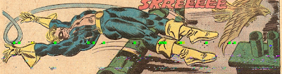
*"Batman" copyright DC Comics. images from Detective#426. Oct 1971. "Captain America" & "Nomad" copyright Marvel Comics. Images from CA. # 182 and #183, Feb. March 1974-75. apologies for the bad scans!

Monday, February 16, 2009

Look Out!Monsters at Comicmonsters.com

One of the nicer moments at NYC Comic-con was being introduced to
Rob Caprilozzi and his wife and their website: http://www.comicmonsters.com/ , where you will find everything you ever wanted to know about monster comics new and old. It's a terrific site, chock-a-block full of interesting material--particularly the "Making of..." feature--which highlights the creative process of just about everyone working in the genre of "Monster Comics" today. I've been asked to contribute a piece as well-and I'll be putting that together in the next few weeks.
Meanwhile---The Big Bad Wolf asked me some questions about "Look Out!Monsters!"-
and that interview is right here:
http://www.comicmonsters.com/features-988-Geoff_Grogan_talks_LOOK_OUT___MONSTERS.html

So check it out!

Wednesday, February 4, 2009

Life after Previews

Leave it to me to start a publishing company during an economic avalanche and at the same time that print is sounding its death knell. Not to mention that the largest single comics distributor is effectively eliminating the small press from its catalogue( a development that seems to be welcome to everyone but small press publishers).
Yet is strikes me that Rahm Emanuel has it right when he says that every crisis offers an opportunity (or something to that effect) and for those well positioned, now would seem to be the time for the establishment of a serious and distinct small press/alt-comics distributor.
What would that look like? For starters, I imagine an online only catalogue;-a fully functioning, well maintained and attractive website that presents its vendors well and is user-friendly for retailers and potential customers. In order to draw customers to the site it would have to offer at least a few big independent publishers and a number of well-known independent creators. There'd have to be a big promotional push, advertisements and interviews, signings and events.
I'm not a distributor, nor do I know the intricacies of coordinating hundreds of publishers with thousands of retailers. It takes organization, a good chunk of money and decent technology. It takes more than one person in the office. But there are people out there doing this already-it would seem that now is the time to step up the effort and while it sounds crazy, put some money into the enterprise. It might require small press publishers to pay some kind of annual fee-$100. or so-as in a co-op. Obviously this wouldn't cover expenses for the distributor-but it might fund the website. and that's a start.
Easier said than done, no doubt. But as the mainstream has its single source in Diamond, perhaps if there was a single source for alt-comics, interested retailers, art galleries and bookstores would be able to locate and order our work easily.

Freedom from the mainstream might also encourage the cultivation of a broader array of retailers. Jettisoned from comics shops, alt-comics might begin to find a place in galleries, bookstores, coffee shops and other venues. The model exists, undergrounds sold out of head shops-why shouldn't alt-comics sell out of bookstores and art galleries?

My feeling about Ka-Boom ( the POD printer that has recently announced a direct-market distribution service) is that there are too many limitations. Distribution with Ka-Boom requires printing with Ka-Boom and while that works for some things, I couldn't have done "Look Out!Monsters" or "Nice Work" under those circumstances. No, I don't think tying POD to distribution is appropriate to a movement that seeks to break with the norms in all manners of packaging and content.
These are random thoughts, not fully thought out, admittedly--but the important point is that there exists an opportunity in the fallout from this economic wreck. What form it will take-that has yet to be determined. More web-comics? you bet. An "Image"-style publishing house for art-comics? Hey-that's a whole 'nother post. But ideas are flying now--and its time to contribute to the discussion.
While the dust continues to settle-I'll be in Artist's Alley at the NY Comic-Con this week--with the entire line of L.o.M. books--"Look Out!Monsters (made it onto another "best of 08" list! check out Adam McGovern at Comiccritique.com ), Nice Workand Dr. Speck, the all ages alt-comics "super" hero (well-- his head inflates, what kind of power is that?)--and I'm introducing some brand new posters. In these dour times, I'm looking to have some fun--and what better place to find it than at the Javits Center this weekend?

Friday, January 16, 2009

Patrick McGoohan

There was nothing like "The Prisoner" on television in 1968. There is still very little that compares to it today--in its deliberate quirkiness, its refusal to follow the established formula of the 6o-minute teleplay. Imagine the staid audiences of 1968-trained on "Gunsmoke", "The Andy Griffith Show", "F Troop", even the "Man from U.N.C.L.E." and --tuning in to "The Prisoner". More than one viewer probably called their station to complain--or maybe called the TV repairman to get their "regular TV back on the screen".

I was 8 years old in 1968, left alone during summer Saturday evenings--and "The Prisoner" fascinated me. Man it was weird-soooweird. And creepy. What the hell was that big latex ball? Gave me nightmares-still does.
And that concept--falling asleep, waking up in your own apartment--but transported to an entirely different place--how cool was that? I remember looking out my bedroom window wondering if I really was where I thought I was.
'Good question.
McGoohan gave no quarter in that series, he never succumbed to the conventional demand for closure-revelling instead in the ambiguities raised by his premise, and engaging the philosophical complexities of the post WWII cold-war society we were creating. And if you shared his dark sense of humor-"the Prisoner" was funny -like a knife.And colorful--love those umbrellas. The 'ending" to the series is no ending at all--a maze within a puzzle within a riddle--it answers nothing and yet confirms our worst expectations. Did Six escape? Is there an escape?
It's the narrative possibilities that stay with me today. The questions the series raises-about individuality, about the social collective, mind control-media control; the symbols McGoohan utilized to engage difficult ideas in an entertaining way.
I'm not hopeful for the new series--"The Prisoner" was the result of one man's vision. And like any work of art, there's no recreating it--why bother? It's like trying to repaint Matisse.
So I imagine they should have a parade to celebrate Six in Portmerion. Bring out those rainbow umbrellas, march in unison throughout the square-chanting"SixSixSixSix".
Patrick McGoohan would've hated that. and that's as it should be.

Be seeing you.